原生字体家族
https://fortfoundry.com/fonts/native
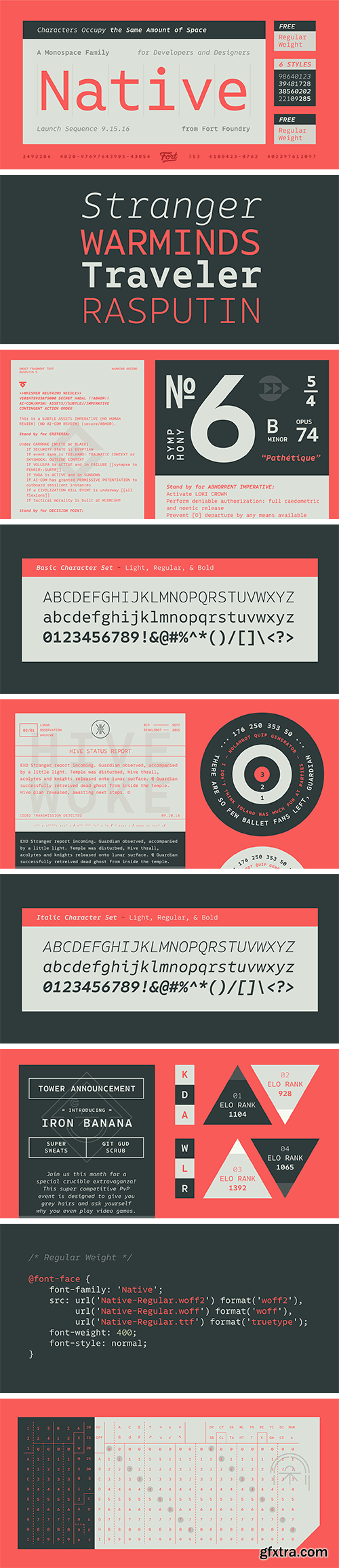
Native seeks to strike a balance between personality and usability. The family’s charm comes out in the tail of the “a” or the flow the italic “r,” but it still retains readability without its quirks becoming overbearing. Native’s counters were kept open in order to aid legibility at smaller sizes, and the italics were given their fair share of differentiation to bring emphasis for items such as a comment in a line of code. Native’s weights and italics all occupy the same amount of horizontal space so no alignment issues will occur when switching between styles.
本站不对文件进行储存,仅提供文件链接,请自行下载,本站不对文件内容负责,请自行判断文件是否安全,如发现文件有侵权行为,请联系管理员删除。