贝尔林斯克 slab 字体系列
https://playtype.com/typefaces/berlingske-slab-display/
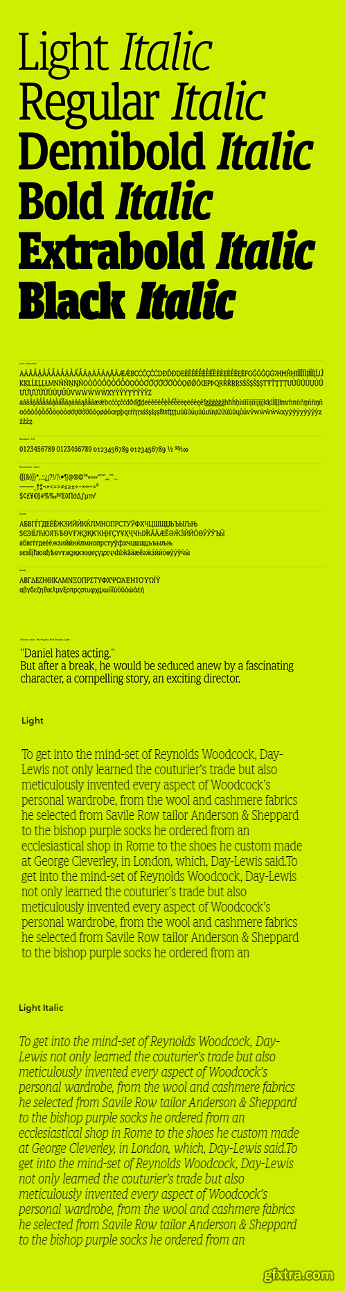
Berlingske Slab Display is crafted with the same robust elegance as the regular slab but has a sharper expression. The capitals have been compressed to create a more compact and tight look making it possible to fit more text into less space. Baseline and capline has been lowered on all glyphs for a more compact design. The details on letters as e, c and k are angled square for a sharper expression. It is intended specifically for display and has a striking and exact look.
本站不对文件进行储存,仅提供文件链接,请自行下载,本站不对文件内容负责,请自行判断文件是否安全,如发现文件有侵权行为,请联系管理员删除。