贝尔林克Sans无衬线字体家族
https://playtype.com/typefaces/berlingske-sans-display/
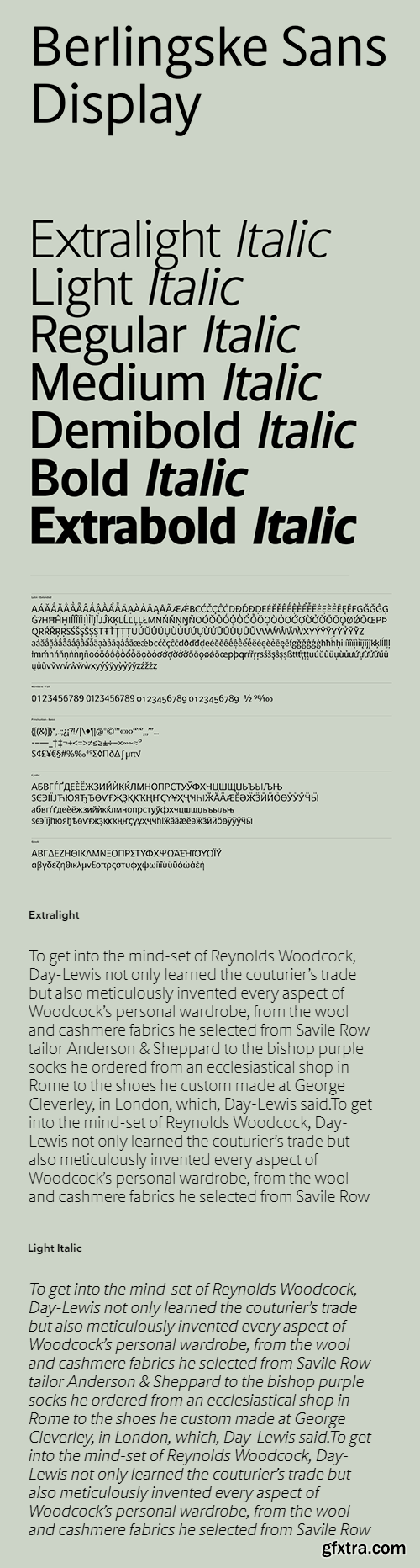
Selected design modifications in the Berlingske Sans have been used to create this strong sans display, which also works extremely well for body text. Some of the terminals have been slightly cut, creating a more square feel in the design. The tall x-height and condensed design, together with the cut terminals, build a solid and steady sans that is less spiky compared to the original Berlingske Sans. The amount of alternates and stylistic sets offer a wide variation of styles, all built into one single font. For a more slender look choose a stylistic set with longer strokes on selected glyphs, or for a softer, curved expression go for the slightly bent strokes on Kk, Rr and Qq. All alternates apply to small caps, ensuring complete consistency.
本站不对文件进行储存,仅提供文件链接,请自行下载,本站不对文件内容负责,请自行判断文件是否安全,如发现文件有侵权行为,请联系管理员删除。